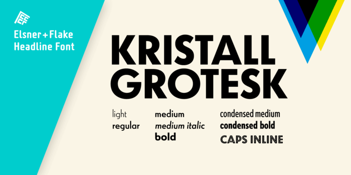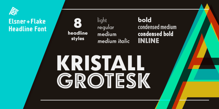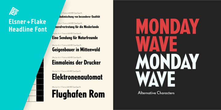
The design of Kristall Grotesk is based on a cut by Wagner & Schmidt, Leipzig, from the 30s of the last century. The basis for the digital version of the Stiftung Werkstattmuseum für Druckkunst , Leipzig was the standard font (28p) of the manual cuts as offered by the font foundry Johannes Wagner, Ingolstadt. The implementation was deliberately created as a replica to create a faithful reproduction as a starting point for the design of other design sizes. The present Kristall Grotesk is therefore a headline design. The appearance of the typeface can be varied by a number of alternative forms of capitals, which, according to the taste of the time, contain either pointed or flat formations.
Designer: Hausschnitt Johannes Wagner, Leipzig, Redesign Elsner+Flake, Hamburg
Designdate: 1937, 2009
Publisher: Elsner+Flake
Design Owner: Stiftung Werkstattmuseum für Druckkunst , Leipzig
Original Foundry: Wagner & Schmidt, Leipzig

